
In some cases, a game’s user interface might ultimately have very little impact on the player’s overall experience. In other cases, such as in many mobile games, engaging with UI might make up nearly the entire game. No matter which scenario your project falls into though, our jobs in the game audio realm remain the same; to create a sonic experience that works hand-in-hand with the other elements presented. Undeniably, great game audio is always working with a game’s systems, visuals, narrative, and world. UI is no different.
In this article I’d like to show you how approaching UI audio as if you yourself were the UI Designer* can help get you closer to crafting a UI that is both aesthetically and functionally cohesive. Whether you’re working with a system that will form the core experience for your players, or just trying to maintain feel and flow between more central parts of the game, this information should give you a solid reference point to plan, work, and iterate from.
While UI design is a massive field with a practically endless rabbit hole of academic papers and various theories, we’re going to narrow it down to some basic principles for our purposes. Depending on where you look and who you ask, you’ll get varying answers to what the main principles of UI design are. While not definitive, here is a pretty good generalized list of some principles that we can use in our approach to examining UI:
- Structure
- Simplicity
- Visibility
- Feedback
- Tolerance
- Reuse
For each principle above, we’ll first look at what it means purely from a UI design perspective. Then we’ll extrapolate on that idea and apply it to how we might design our game’s audio to reinforce it. So without further ado, let’s work from the top! First up...
Structure
UI Design
A good structure in UI design essentially means that there is a clear, overall method of organization to your UI. There is a definite “big picture” macroscopic idea that outlines all of the smaller elements. You could also think of this as having a grouping method. Elements of the UI that relate to each other should be grouped together and/or share visual design qualities. Elements that are unrelated should have enough distinction that the user won’t conflate their purposes. A health bar and a stamina bar are often displayed next to each other, each with a similar visual design. Likewise, it’s probably best in this scenario to put something like ammo count and current weapon next to each other, but somewhere separate from health and stamina.
Ideally, this structure is consistent and easy to follow on any scale. As a simple and arbitrary example, let’s imagine an inventory screen. Suppose this screen has three subcategories for weapons, food, and armor. However you choose to lay out the player’s weapons, it would generally make sense for the player’s food and armor to be laid out in the same way. If one is a grid, one is a dropdown menu, and one is a radial menu, it would just feel clunky and disorienting.
Audio
For us sound designers, the focus here should be to reflect the structure that we’re given. If there’s a clear separation between how the game’s inventory menu and map menu are structured for the player, then perhaps we would want to group the designed UI sounds into those two groups. At the same time, there is undoubtedly some features and functions that are the same across both menus.
It might help to have some way to visualize the structure in our head as we plan how we will approach the sound design for this section of the game. Since this is an arbitrary example, a simple Venn diagram like the one below can give a good general idea of how we might group sounds to work with the UI structure. In this case, let’s imagine a game with an “Inventory” screen where we can use and craft items, as well as a “Map” screen, where we can also make use of certain navigation-specific items.
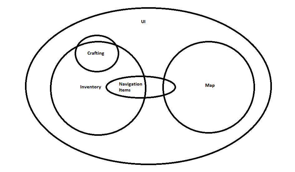
An arbitrary diagram to help visualize the UI structure
Looking at this diagram, one approach might be to have a palette of particular layers that correspond to “Inventory” or “Map” actions. When the player uses their navigation items, they might hear sounds that are constructed mostly from our “Inventory” layers, with some subtle elements from our “Map” palette. When the player performs actions related to crafting, they might hear a specialized group of sounds based off of the “Inventory” palette. You can do a similar approach by using particular processing chains, or designing a particular shape or rhythm to the sounds in each category. However you approach it, just remember that the goal here is to work with the structure that’s already there.
Simplicity
UI Design
The goal of simplicity in UI design is exactly what it sounds like. Perhaps this can be more eloquently said by stating an old mantra that has led generations of successful creatives. “K.I.S.S.": Keep It Simple, Stupid.
The principle of simplicity in UI design means that an interface should be only as complex as is appropriate for the necessary tasks. Most cell phones have volume buttons that are in a convenient spot when holding the phone naturally. Nobody wants to have to open 3 layers of settings menus every time they want to adjust the volume of the music they’re listening to. Additionally, all that’s needed is a single button for raising volume, and a single button for lowering volume. Adding more than that (like, say, a button for maximum volume) would be unnecessary, and would probably cause more problems than it solves.
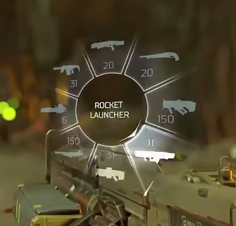
Radial menus, like the one used in 2016’s “Doom”, are a common way to simplify tasks down to only one simultaneous use of a button and an analog stick.
Audio
Similarly, simple tasks only need simple audio to accompany them. Any audio person knows that balance, contrast, and context are huge factors in how an individual sound affects a player. If adjusting the brightness setting uses cannonfire and huge industrial machinery chunks on every tick, we’re going to have a difficult time making that “Start” button feel as satisfying as it should be. Obviously, I’m speaking hyperbolically, but I’m sure you get the point.
Similarly, how we choose to implement our audio should always be done with a purpose. While it might be fun to have a procedural sound design algorithm that generates infinite click variations for every button, using a system like that in a game probably won’t actually be contributing to the player’s experience. In fact, it will most likely cause confusion. On the other hand, if the UI is comprised of several dynamic layers (for example, if changing settings in one menu affects the layout of another), then adhering too much to simplicity and not reflecting that dynamic behavior might also be a poor choice. There’s a certain balance that needs to be achieved which depends entirely on context. In the end, the degree of simplicity or complexity in your sound should be decided with a specific purpose in mind.
Visibility (Hearability)
UI Design
The visibility principle in UI design essentially means that the player should be able to see everything they need to see at any given time. Of course, this also means that they should only see what needs to be seen, and that extraneous information should be avoided as much as possible. On one hand, it would be immensely annoying if you had to open an extra menu to view your health bar. On the other hand, there’s pretty much no case in any game that the player needs to see their current volume settings displayed on the HUD.
The degree of visibility also comes into play here. Many games have both a health bar and a stamina bar. In a lot of cases, the health bar is larger and easier to see than the stamina bar. This is usually because the design of the game demands that players tend to prioritize checking their health over checking their stamina.

“The Legend of Zelda: Breath of the Wild” has a very minimalistic HUD, and even allows the player to remove all HUD elements except for health. In this case, the player has some small agency in deciding what is necessary and what is excess.
Audio
Of course, a game’s audio has nothing to do with what the player sees, but just the same, it’s important to filter the information that they hear. This could be tricky! It requires a solid understanding of the game’s design goals to know what information is and is not important. It also requires good planning and communication among the sound team to ensure that the final mix is not cluttered, and allows for important UI sounds to be heard when they need to be.
As an example, let’s say our project is an online first-person shooter. These games tend to require constant attention, so we want to avoid breaking the player’s focus as much as possible. In this case, for some behaviors, we might want to omit sound entirely. Public text chat is one feature that would just become a nuisance if there were an alert sound on every message. On the other hand, if the player receives an invitation to join a friend’s session, we might want to draw some attention to that. However, we’d also want to make sure that it’s both distinct and subtle. It’s something that should not be confused with an event in the player’s current session, nor should it interfere with the current session’s mix and potentially cover up important sounds, such as the footsteps of an enemy player.
So what about when we want to draw attention? In a more casual social game, you might want to make sure that a player knows they’ve received a friend request or a game invite. In these cases, utilizing the evolved traits of the human ear to your advantage can work wonders. Clicky transient material does a great job of sticking out above a mix, as well as alerting us to locations in 3D space. Sounds that increase in volume over a short time trigger our intuitive sense that something is quickly approaching us, which will naturally draw the ear to that sound. Additionally, human speech sits roughly around the 1kHz-5kHz range, and we’re automatically more keen to pick up on sounds in that range. In particular, even more potent is the range of a baby’s cry--about 4kHz. Many default ringtones and phone alert sounds actually utilize these exact patterns!
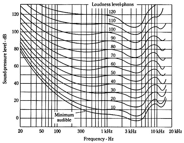
The Fletcher-Munson curve is a standard representation of how the human ear perceives different frequency ranges (aka an equal-loudness contour). Notice the dip around 4kHz—the approximate center range of a baby’s cry.
If you find you’re still having difficulty getting a sound to stand out, dynamic mixing is your friend. Sidechaining or temporarily filtering certain groups of sounds will undoubtedly draw attention to the event you’re trying to highlight. Now, we’ve only covered the first three items on our list of principles...for now! Don’t worry, though. Just be sure to come back for part 2, where we’ll get through the rest of our list, as well as some final thoughts on how we can put all of this information together.
Thanks to Emilio G. and George Lobo for lending their professional feedback on this article as it was written.
* I should clarify that I am not in any way a professional UI designer. I am purely a sound designer. If any actual UI designers would like to correct me or modify any of the information in this article, I would love to receive your critique and contribution!

Comments